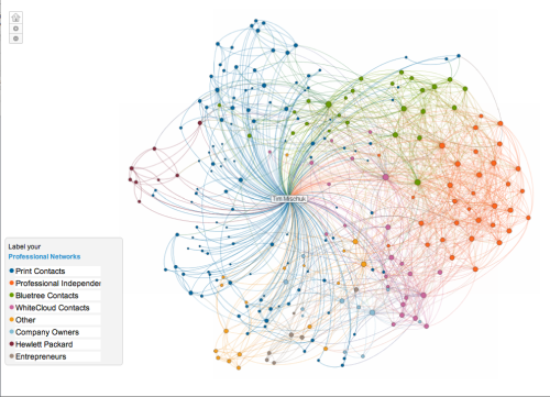
Linked-in creates essentially a network of people you connect with and influence. In return, your network may influence your decisions. As a B2B tool this is fantastic way to see that you ‘as a brand’ are connected and influencing others organically.
You can see the way all your connections are related to each other? Identify the hubs between your professional careers?
Your map is color-coded to represent affiliations or groups from your professional career, such as your previous employer, college classmates, or industries you’ve worked in. In my InMap, my LinkedIn print colleagues are in dark blue, while my former colleagues at HP are maroon and professional independents are in Tangerine. I connected with these key groups are unique times in my group and Linked-In does a great job pulling these together.
Big names represent contacts who are most influential and connected within that specific cluster or group. When you click on a contact within a circle you’ll see their profile pop up on the right, as well as lines highlighting how they’re connected to your connections.
My map is actually a view of how my professional world has been created over time. It helps to label each color and explore your connections to see who are the major connectors on your diagram. You can use those insights to measure your own impact or influence, or create opportunities for someone else.
Take some time visually exploring your network. You will enjoy this fascinating study on both influencers, connections and how they intersect and join
To access your InMap, go to http://inmaps.linkedinlabs.com.


